


I’ve spent way too many hours trying to recreate that perfect Blade Runner look in MidJourney. You know what I’m talking about, those rain-soaked streets with neon reflections, the massive buildings disappearing into fog, that specific feeling where everything looks both futuristic and broken at the same time.
The problem? Just typing “Blade Runner style” into MidJourney gets you… something. But it usually looks more like generic cyberpunk than actual Blade Runner cinematography. After testing dozens of prompts (and wasting a bunch of fast hours), I figured out what actually works.
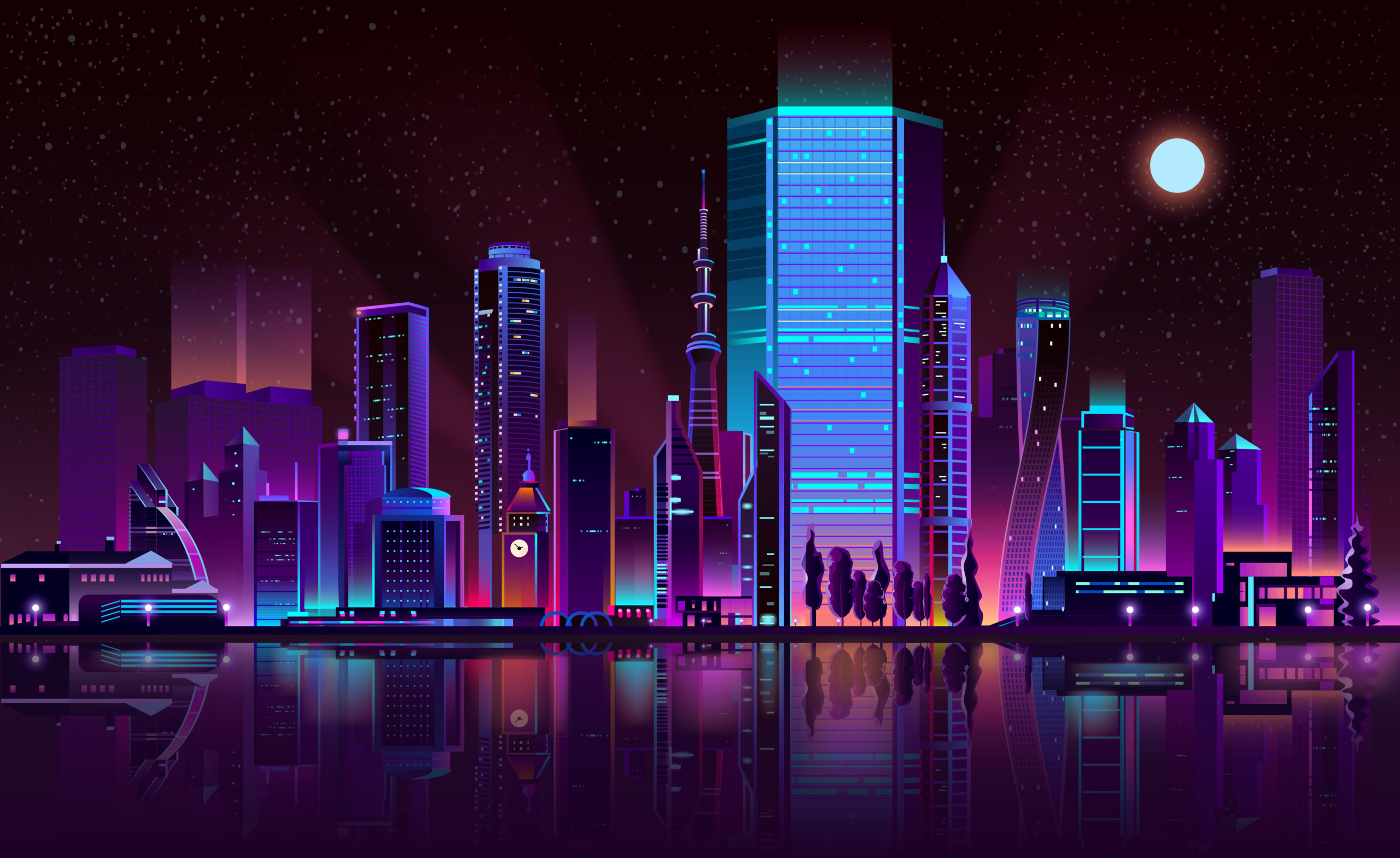
Table of Contents
Why Most Blade Runner Prompts Fail
Here’s the thing about Blade Runner’s look, it’s not really about flying cars or neon signs. Those are just surface details. What makes Blade Runner imagery so distinctive is the mood. It’s noir cinematography mixed with science fiction, all filtered through this sense of beautiful decay.
The original film gives you dense, crowded streets. Neon everywhere, constant rain, steam rising from grates. It feels claustrophobic and alive. Blade Runner 2049 went the opposite direction, vast empty spaces, monumental buildings, humans looking tiny and alone. Same universe, completely different visual approach.
Your first decision when writing a MidJourney prompt for Blade Runner style is figuring out which direction you want. Cramped neon streets or lonely architectural shots? Pick one. Trying to do both in the same image just creates confusion.
The Prompt Structure That Actually Gets Results
Most people treat MidJourney prompts like a word salad, throw in every descriptive term they can think of and hope something good happens. That’s not how this works. MidJourney reads your prompt in order, paying more attention to words at the beginning.
Think of it like describing a scene to a cinematographer. You wouldn’t randomly jump between lighting, colors, and camera angles. You’d build the description logically: what’s in the shot, where it is, what time of day, how you’re shooting it.
Here’s the order that consistently works for me:
- Subject first (who or what we’re looking at)
- Environment (where they are)
- Weather and time of day
- Camera angle
- How light behaves
- Color palette (and this matters more than anything else)
- Atmosphere effects
Working Blade Runner Prompts You Can Actually Use
For Dense Neon Street Scenes
lone figure in trench coat walking through crowded street market, dense futuristic alley with towering buildings, nighttime steady rain, street-level shot, hard rim lighting from cyan neon signs, teal base with small magenta accents, light beams through rain, wet pavement reflections , ar 21:9 , style raw , stylize 150 , v 6.0
Notice the color choices here. Teal base, small magenta accents. Not “rainbow neon explosion.” That restraint is what makes it look cinematic instead of like a Vegas casino. The original Blade Runner was actually pretty controlled with color, it just felt saturated because those specific colors were used so deliberately.
The rim lighting is crucial too. That’s what separates your subject from the background when everything’s dark and hazy. Without it, your figure just disappears into the murk.
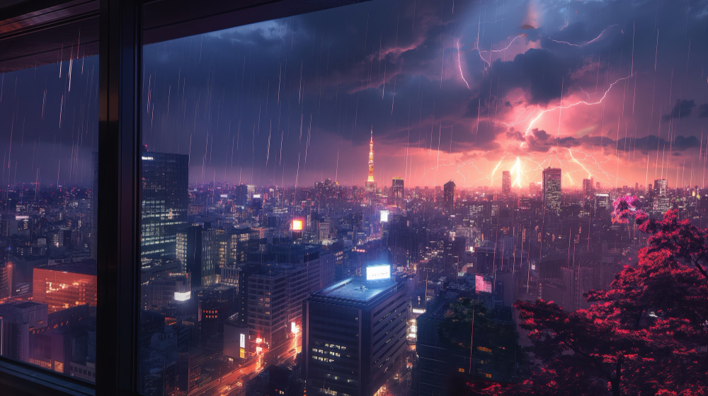
For Massive Architecture Shots
solitary human dwarfed by giant brutalist structures, empty futuristic city outskirts, overcast dusk with dust in air, ultra-wide shot from ground level, soft diffused lighting, monochrome orange palette, subtle haze, symmetrical composition with empty space , ar 21:9 , style raw , stylize 140 , v 6.0
This is the Blade Runner 2049 approach. Everything about this prompt screams isolation, “dwarfed,” “empty,” “solitary.” The monochrome orange gives you that dusty apocalyptic look without competing colors fighting for attention.
Also notice: “ultra-wide shot from ground level.” That camera choice is doing work. It makes the buildings feel even more overwhelming because you’re looking up at them from a human perspective.
The Color Mistake Everyone Makes
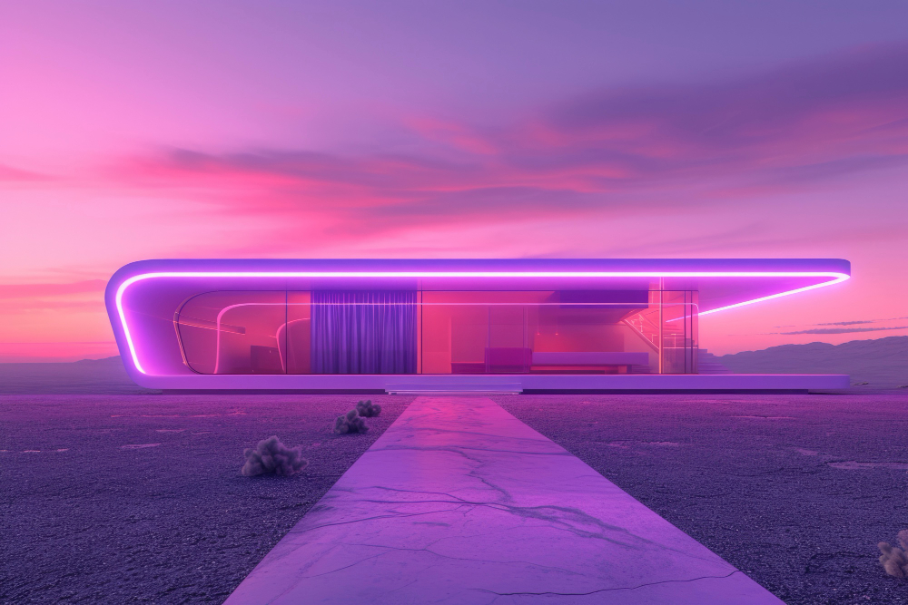
Alright, this is probably the most important thing I learned: stop using so many colors. Seriously. When people think cyberpunk, they think neon rainbow, pink, blue, purple, green, orange, all competing. But actual Blade Runner? Most scenes use two, maybe three colors max.
Look at the iconic scenes. They’re usually cyan and magenta. Or blue and amber. Or just monochrome orange. That’s it. The restraint is what makes it look like professional cinematography instead of a random digital painting.
Here’s a quick test: if your MidJourney image looks chaotic, remove colors. Don’t add them. Simplify down to two complementary colors and see what happens. Nine times out of ten, suddenly it looks way more cinematic.
Also, be specific about intensity. Don’t just say “magenta”, MidJourney might make everything magenta. Say “small magenta accents” or “restrained pink highlights.” That one word changes the entire image.
Why Atmosphere Makes or Breaks the Shot
If there’s one thing that defines Blade Runner more than anything else, it’s atmosphere. And I mean literal atmosphere, rain, fog, haze, steam. This isn’t decoration. It’s how the light behaves.
Those visible light beams cutting through darkness? You only see those when light hits something in the air. No fog or rain means no light beams. But here’s where people screw up: they stack atmospheric terms thinking more is better. “Foggy misty hazy rainy steamy smoky”, and the image comes back looking like mud.
Pick one or two atmospheric elements and be specific. “Steady rainfall” works better than just “rain.” “Light beams through rain” is more precise than “atmospheric.” “Airborne dust particles” tells MidJourney exactly what you want.
If your result looks too muddy, don’t add more atmosphere, reduce it and add rim lighting instead. That brings back definition without losing the mood.
Camera Angles and Aspect Ratios (This Stuff Matters)
The default 1:1 square format never looks cinematic. Never. Blade Runner’s whole visual language depends on wide compositions. You need horizontal space to create that sense of scope.
For Blade Runner aesthetics, always use:
- 16:9 (-ar 16:9) for standard cinematic framing
- 21:9 (-ar 21:9) for ultra-wide shots, perfect for 2049-style compositions
Camera perspective matters just as much. Wide shots emphasize the environment and make humans feel small. Medium shots focus on character while showing context. Blade Runner rarely does extreme close-ups unless it’s an emotional reveal.
Specify your shot: “street-level medium shot,” “wide establishing shot,” “low angle looking up.” This gives MidJourney clear compositional guidance instead of leaving it to guess.
Getting Consistent Results (Stop Starting From Scratch)
The most frustrating part of AI art? You generate one amazing image, then spend the next hour trying to recreate that look and nothing works. This happens because people treat every generation like a fresh start.
Better approach: when you get a strong result, lock it down. Use the seed number from that image (react with the envelope emoji in Discord to see it). Then change one thing at a time.
Got a great rain-soaked street? Keep the lighting, colors, aspect ratio, everything, just change the subject from “lone figure” to “abandoned vehicle” or “two people talking.” Now you’re building a consistent world instead of randomly generating unrelated images.
Also, keep a document with prompts that work. I have a file full of successful color combinations, lighting setups, and atmospheric descriptions. It saves hours of testing.
The Technical Settings That Actually Matter
Parameters at the end of your prompt can make or break results, but most people overthink them. Here’s what actually works for Blade Runner style:
- -style raw: Removes MidJourney’s default prettification. Essential for photorealistic cinematography.
- -stylize 140-160: Sweet spot for Blade Runner. Lower stays literal, higher gets more artistic.
- -chaos 2-4: Low chaos for architectural precision, slightly higher for street scenes with some randomness.
- -ar 21:9: As discussed, widescreen is non-negotiable.
Don’t go crazy with parameters. If your image isn’t working, the problem is almost always in the prompt itself, not the settings.
Quick Fixes for Common Problems
Image too dark or muddy?
Add rim lighting and reduce atmosphere. Try “hard rim lighting from [neon signs/streetlights/whatever]” to separate subject from background.
Colors look chaotic?
Simplify to two colors max. Use words like “restrained” or “subtle” to control intensity.
Doesn’t feel cinematic?
Check aspect ratio (must be 16:9 or wider) and add camera perspective (“wide shot,” “street-level view,” etc.).
Subject gets lost?
Put subject at the very start of your prompt and add rim/backlighting for separation.
What Actually Makes It Look Like Blade Runner
After all this testing, I realized something: creating good Blade Runner-style art isn’t about memorizing the perfect prompt formula. It’s about understanding what makes that aesthetic work, the relationship between light and atmosphere, the discipline of limited colors, the emotional weight of scale.
The best prompts communicate clear intent. Not “make it look like Blade Runner,” but “create a rain-slicked street with cyan neon reflecting off wet pavement while a lone figure walks through rising steam.” That specificity, plus controlled colors and smart atmosphere use, is what makes images feel like actual film frames.
Start with the structures I shared, but don’t treat them like rigid rules. Change one element at a time and see what happens. Build up your own library of what works. Eventually you’ll develop instinct for which combinations create the mood you want.
The real secret? Blade Runner’s power comes from restraint. Not from spectacle, but from mood. When your images start making you feel something, that mix of beauty and decay, hope and loneliness, the human struggle against overwhelming odds, that’s when you know you’ve nailed it.